Chapter 27 FROC vs. wAFROC
27.1 TBA How much finished
50% Need to replace simulation values with analytical values
27.2 Introduction
In the medical imaging context the FROC curve, which was introduced in (Philip C Bunch et al. 1977), has been widely used for evaluating performance in the free-response paradigm, particularly in CAD algorithm development. Typically CAD researchers report sensitivity at a stated value of false positives per image, i.e., they report a pair of values. (TBA) From basic ROC analysis, see Section 10.13, we know that a scalar FOM is preferable to reporting a pair of values. This chapter recommends adoption of the area under the wAFROC as the preferred scalar figure of merit in lieu of sensitivity / false positives per image pairs. operating characteristic in assessing performance in the free-response paradigm, and details simulation-based studies supporting this recommendation.
27.3 FROC vs. wAFROC
Recall, from Section 24.7, that the RSM is defined by parameters \(\mu, \lambda, \nu\) and \(\zeta_1\). This section examines RSM-predicted TBA analytical FROC, wAFROC and ROC panels for two observers denoted R1 and R2. The former could be an algorithmic observer while the latter could be a radiologist. For typical threshold \(\zeta_1\) parameters, three types of situations are considered: R2 has moderately better performance than R1, R2 has much better performance than R1 and R2 has slightly better performance than R1. For each type of simulation pairs of FROC, wAFROC and ROC curves are shown, one for each observer. Finally the simulations and panels are repeated for hypothetical R1 and R2 observers who report all suspicious regions, i.e., \(\zeta_1 = -\infty\) for each observer. Both R1 and R2 observers share the same \(\lambda, \nu\) parameters, and the only difference between them is in the \(\mu\) and \(\zeta_1\) parameters.
27.3.1 Moderate difference in performance
source(here("R/CH13-CadVsRadPlots/CadVsRadPlots.R"))

nu <- 1
lambda <- 1
K1 <- 500
K2 <- 700
mu1 <- 1.0
mu2 <- 1.5
zeta1_1 <- -1
zeta1_2 <- 1.5
Lmax <- 2
seed <- 1

ret <- do_one_figure (
  seed, Lmax, mu1,
  mu2, lambda, nu, zeta1_1, zeta1_2, K1, K2)

froc_plot_1A <- ret$froc_plot_A
wafroc_plot_1B <- ret$wafroc_plot_B
roc_plot_1C <- ret$roc_plot_C
froc_plot_1D <- ret$froc_plot_D
wafroc_plot_1E <- ret$wafroc_plot_E
roc_plot_1F <- ret$roc_plot_F
wafroc_1_1B <- ret$wafroc_1_B
wafroc_2_1B <- ret$wafroc_2_B
roc_1_1C <- ret$roc_1_C
roc_2_1C <- ret$roc_2_C
wafroc_1_1E <- ret$wafroc_1_E
wafroc_2_1E <- ret$wafroc_2_E
roc_1_1F <- ret$roc_1_F
roc_2_1F <- ret$roc_2_F
The \(\lambda\) and \(\nu\) parameters are defined at lines 3 and 4 of the preceding code: \(\lambda = \nu = 1\). The number of simulated cases is defined, lines 5-6, by \(K_1 = 500\) and \(K_2 = 700\). The simulated R1 observer \(\mu\) parameter is defined at line 7 by \(\mu_{1} = 1\) and that of the simulated R2 observer is defined at line 8 by \(\mu_{2} = 1.5\). Based on these choices one expect R2 to be moderately better than R1. The corresponding threshold parameters are (lines 9 -10) \(\zeta_{1} = -1\) for R1 and \(\zeta_{1} = 1.5\) for R2. The maximum number of lesions per case is defined at line 11 by Lmax = 2. The actual number of lesions per case is determined determined by random sampling within the helper function do_one_figure() called at lines 14-16. This function returns a large list ret, whose contents are as follows:
ret$froc_plot_A: a pair of FROC panels for the thresholds specified above, a red panel labeled “R: 1” corresponding to R1 and a blue panel labeled “R: 2” corresponding to R2. These are shown in panel A.ret$wafroc_plot_B: a pair of wAFROC panels, similarly labeled. These are shown in panel B.ret$roc_plot_C: a pair of ROC panels, similarly labeled. These are shown in panel C.ret$froc_plot_D: a pair of FROC panels for the both thresholds at \(-\infty\). These are shown in panel D.ret$froc_plot_E: a pair of wAFROC panels for the both thresholds at \(-\infty\). These are shown in panel E.ret$froc_plot_F: a pair of ROC panels for the both thresholds at \(-\infty\). These are shown in panel F.ret$wafroc_1_B: the wAFROC AUC for R1, i.e., the area under the curve labeled “R: 1” in panel B.ret$wafroc_2_B: the wAFROC AUC for R2, i.e., the area under the curve labeled “R: 2” in panel B.ret$roc_1_C: the ROC AUC for R1, i.e., the area under the curve labeled “R: 1” in panel C.ret$roc_2_C: the ROC AUC for R2, i.e., the area under the curve labeled “R: 2” in panel C.ret$wafroc_1_E: the wAFROC AUC for R1, i.e., the area under the curve labeled “R: 1” in panel E.ret$wafroc_2_E: the wAFROC AUC for R2, i.e., the area under the curve labeled “R: 2” in panel E.ret$roc_1_F: the ROC AUC for R1, i.e., the area under the curve labeled “R: 1” in panel F.ret$roc_2_F: the ROC AUC for R2, i.e., the area under the curve labeled “R: 2” in panel F.
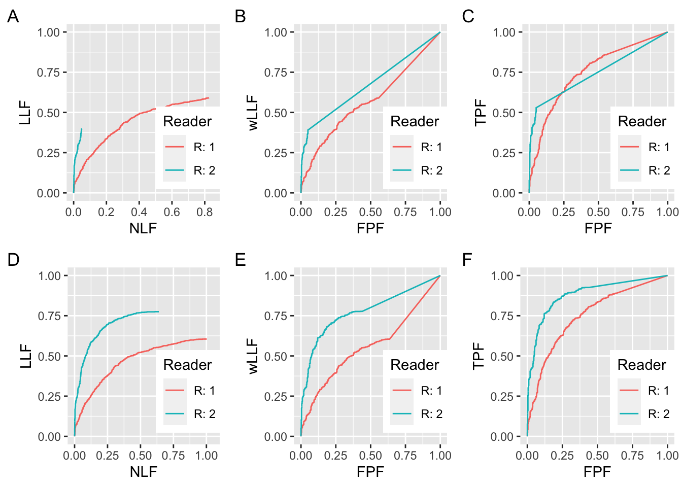
FIGURE 27.1: Plots A and D: FROC curves for the R1 and R2 observers; B and E are corresponding wAFROC curves and C and F are corresponding ROC curves. All curves in this plot are for \(\lambda = \nu = 1\). All RAD_1 curves are for \(\mu = 1\) and all RAD_2 curves are for \(\mu = 1.5\). For panels A, B and C, \(\zeta_1 = -1\) for R1 and \(\zeta_1 = 1.5\) for R2. For panels D, E and F, \(\zeta_1 = -\infty\) for R1 and R2.
The coordinates of the end-point of the R1 FROC in panel A are (0.826, 0.590). Those of the R2 FROC curve in A are (0.049, 0.398). The FROC for the R1 observer extends to much larger NLF values while that for the R2 observer is relatively short and steep. One suspects the R2 observer is performing better than R1: he is better at finding lesions and producing fewer NLs, both of which are desirable characteristics, but he is adopting a too-strict reporting criterion. If he could be induced to relax the threshold and report more NLs, his LLF would exceed that of the R1 observer while still maintaining a lower NLF. However, as this involves a subjective extrapolation, it is not possible to objectively quantify this from the FROC curves. The basic issue is the lack of a common NLF range for the two panels. If a common NLF range is “forced”, for example defined as the common NLF range 0 to 0.0492, where both curves contribute, it would ignore most NLs from the R1 observer.
Algorithm developers typically quote LLF at a specified NLF. According to the two panels in A, the R2 observer is better if the NLF value is chosen to less than 0.0492 - this is the maximum NLF value for the R2 curve in A - but there is no basis for comparison for larger values of NLF (because the R2 observer does not provide any data beyond the observed end-point). A similar problem was encountered in ROC analysis when comparing a pair of sensitivity-specificity values, where, given differing choices of thresholds, ambiguous results can be obtained, see Section 10.13. Indeed, this was the rationale for using AUC under the ROC curve as an unambiguous measure of performance.
Plot B shows wAFROC curves for the same datasets whose FROC curves are shown in panel A. The wAFROC is contained within the unit square, a highly desirable characteristic, which solves the lack of a common NLF range problem with the FROC. The wAFROC AUC under the R2 observer is visibly greater than that for the R1 observer, even though – due to his higher threshold – his AUC estimate is actually biased downward (because the R2 observer is adopting a high threshold, his \(\text{LLF}_{\text{max}}\) is smaller than it would have been with a lower threshold, and consequently the area under the large straight line segment from the uppermost non-trivial operating point to (1,1) is smaller). AUCs under the two wAFROC panels in B are 0.5731 for R1 and 0.6737 for R2.
Plot C shows ROC curves. Since the curves cross, it is not clear which has the larger AUC. AUCs under the two curves in C are 0.7499 for R1 and 0.7453 for R2, which are close, but here is an example where the ordering given by the wAFROC is opposite to that given by the ROC.
Plots D, E and F correspond to A, B and C with this important difference: the two threshold parameters are set to \(-\infty\). The coordinates of the end-point of the R1 FROC in panel D are (1.002, 0.605). Those of the R2 FROC in panel D are (0.639, 0.775). The R2 observer has higher LLF at lower NLF, and there can be no doubt that he is better. Panels E and F confirm that R2 is actually the better observer over the entire FPF range. AUCs under the two wAFROC curves in E are 0.5605 for R1 and 0.7780 for R2. AUCs under the two ROC curves in F are 0.7513 for R1 and 0.8826 for R2. These confirm the visual impressions of panels in panels E and F. Notice that each ROC AUC is larger than the corresponding wAFROC AUC. This is because the probability of a lesion localization (case is declared positive and a lesion is correctly localized) is smaller than the probability of a true positive (case is declared positive). In other words, the ROC is everywhere above the wAFROC.
27.3.2 Large difference in performance
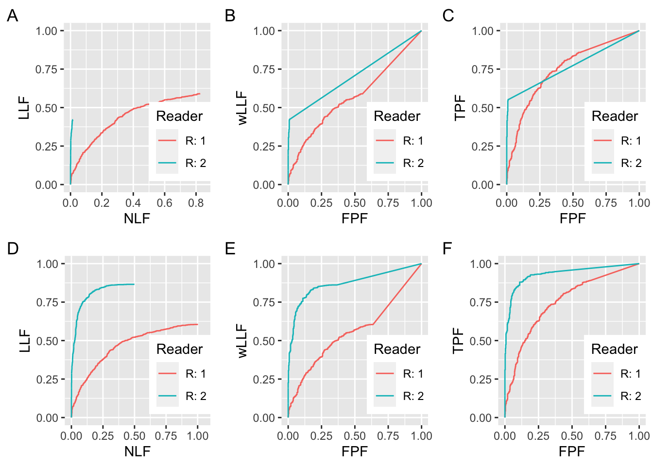
FIGURE 27.2: Similar to preceding figure but with the following changes. All RAD_2 curves are for \(\mu = 2\) and for panels A, B and C \(\zeta_1 = 2\) for R2.
In Fig. 27.2 panel A, the R1 parameters are the same as in Fig. 27.1, but the R2 parameters are \(\mu_{2} = 2\) and \(\zeta_1 = +2\). Doubling the separation parameter over that of R1 (\(\mu_{1} = 1\)) has a huge effect on performance. The end-point coordinates of the FROC for R1 are (0.826, 0.590). The end-point coordinates of the FROC for R2 are (0.015, 0.421). The common NLF region defined by NLF = 0 to NLF = 0.0150 would exclude almost all of the marks made by R1. The wAFROC panels in panel B show the markedly greater performance of R2 over R1 (the AUCs are 0.5731 for R1 and 0.7075 for R2). The inter-reader difference is larger (compared to Fig. 27.1 panel B), despite the greater downward bias working against the R2 observer. Panel C shows ROC panels for the two observers. Although the curves cross, it is evident that R2 has the greater AUC. The AUCs are 0.7499 for R1 and 0.7722 for R2.
Plots D, E and F correspond to A, B and C with the difference that the two threshold parameters are set to \(-\infty\). The coordinates of the end-point of the R1 FROC in panel D are OpPtStr(nlf_1_2D, llf_1_2D). Those of the R2 FROC in panel D are OpPtStr(nlf_2_2D, llf_2_2D). The R2 observer has higher LLF at lower NLF, and there can be no doubt that he is better. Panels E and F confirm that R2 is actually the better observer over the entire FPF range. AUCs under the two wAFROC curves in E are 0.5605 for R1 and 0.8720 for R2. AUCs under the two ROC curves in F are 0.7513 for R1 and 0.9343 for R2. These confirm the visual impressions of panels in panels E and F. Notice that each ROC AUC is larger than the corresponding wAFROC AUC.
27.3.3 Small difference in performance and identical thresholds
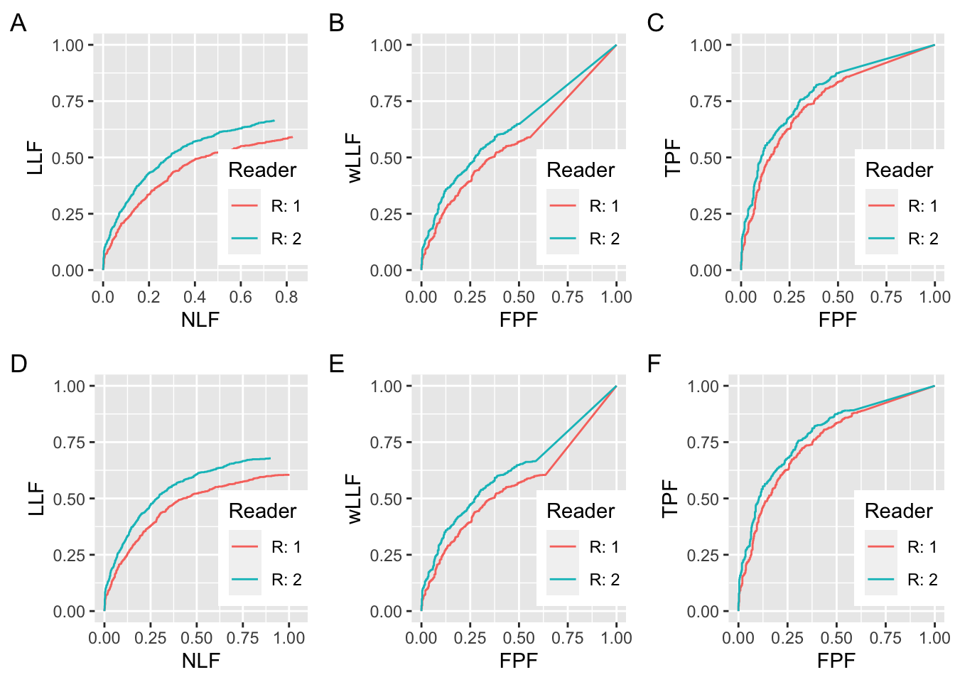
FIGURE 27.3: Similar to preceding figure but with the following changes. All RAD_2 curves are for \(\mu = 1.1\) and for panels A, B and C, \(\zeta_1 = -1\) for R2.
The final example, Fig. 27.3 shows that when there is a small difference in performance, there is less ambiguity in using the FROC as a basis for measuring performance. The R1 parameters are the same as in Fig. 27.1 but the R2 parameters are \(\mu = 1.1\) and \(\zeta_1= -1\). In other words, the \(\mu\) parameter is 10% larger and the thresholds are identical. This time there is much more common NLF range overlap in panel A and one is counting most of the marks for the R1 reader. The end-point coordinates of the FROC for R1 are (0.826, 0.590). The end-point coordinates of the FROC for R2 are ((0.746, 0.664). The common NLF region defined by NLF = 0 to NLF = 0.7458 includes almost all of the marks made by R1. The wAFROC panels in panel B show the slight greater performance of R2 over R1 (the AUCs are 0.5731 for R1 and 0.6341 for R2). Panel C shows ROC panels for the two observers. Although the curves cross, it is evident that R2 has the greater AUC. The AUCs are 0.7499 for R1 and 0.7722 for R2.
Plots D, E and F correspond to A, B and C with the difference that the two threshold parameters are set to \(-\infty\). The coordinates of the end-point of the R1 FROC in panel D are ((1.002, 0.605). Those of the R2 FROC in panel D are ((0.901, 0.678). Panels E and F confirm that R2 is actually the better observer over the entire FPF range. AUCs under the two wAFROC curves in E are 0.5605 for R1 and 0.6238 for R2. AUCs under the two ROC curves in F are 0.7513 for R1 and 0.7857 for R2. These confirm the visual impressions of panels in panels E and F. Notice that each ROC AUC is larger than the corresponding wAFROC AUC.
27.4 Summary of simulations
The following tables summarize the numerical values from the plots in this chapter. Table 27.1 refers to the R1 observer, and Table 27.2 refers to the R2 observer.
27.4.1 Summary of R1 simulations
| wAFROC-B | wAFROC-E | ROC-C | ROC-F |
|---|---|---|---|
| 0.5731 | 0.5605 | 0.7499 | 0.7513 |
- The first column is labeled “wAFROC-B”, meaning the R1 wAFROC AUC in panel B, which are identical for the three figures (one may visually confirm that the red curves in panels A, B ad C in the three figures are identical; likewise for the red curves in panels D, E and F).
- The second column is labeled “wAFROC-E”, meaning the R1 wAFROC AUC in panel E, which are identical for the three figures.
- The third column is labeled “ROC-C”, meaning the R1 ROC AUC in panel C, which are identical for the three figures.
- The fourth column is labeled “ROC-F”, meaning the R1 ROC AUC in panel F, which are identical for the three figures.
27.4.2 Summary of R2 simulations
| Fig | wAFROC-B | wAFROC-E | ROC-C | ROC-F |
|---|---|---|---|---|
| 1 | 0.6737 | 0.778 | 0.7453 | 0.8826 |
| 2 | 0.7075 | 0.872 | 0.7722 | 0.9343 |
| 3 | 0.6341 | 0.6238 | 0.7868 | 0.7857 |
- The first column refers to the figure number, for example, “1” refers to Fig. 27.1, “2” refers to Fig. 27.2, and “3” refers to Fig. 27.3.
- The second column is labeled “wAFROC-B”, meaning the R2 wAFROC AUC corresponding to the blue curve in panel B.
- The third column is labeled “wAFROC-E”, meaning the R2 wAFROC AUC corresponding to the blue curve in panel E.
- The fourth column is labeled “ROC-C”, meaning the R2 ROC AUC corresponding to the blue curve in panel C.
- The fifth column is labeled “ROC-F”, meaning the R2 ROC AUC corresponding to the blue curve in panel F.
27.4.3 Comments
- For the same figure label the R1 panels are identical in the three figures. This is the reason why Table 27.1 has only one row. A fixed R1 dataset is being compared to varying R2 datasets.
- The first R2 dataset, Fig. 27.1 A, B or C, might be considered representative of an average radiologist, the second one, Fig. 27.2 A, B or C, is a super-expert and the third one, Fig. 27.3 A, B or C, is only nominally better than R1.
- Plots D, E and F are for hypothetical R1 and R2 observers that report all suspicious regions. The differences between A and D are minimal for the R1 observer, but marked for the R2 observer. Likewise for the differences between B and E.
27.5 Effect size comparison
- The effect size is defined as the AUC – calculated using either wAFROC or ROC – difference between RDR-2 and RDR-1 for the same figure. For example, for Fig. 27.2 and the wAFROC AUC effect size, one takes the difference between the AUCs under the R2 (blue) minus R1 (red) curves in panel B.
- In all three figures the wAFROC effect size (ES) is larger than the corresponding ROC effect size.
- For Fig. 27.1 panels B and C:
- The wAFROC effect size is 0.1006,
- The ROC effect size is -0.0047.
- For Fig. 27.2 panels B and C:
- The wAFROC effect size is 0.1344,
- The ROC effect size is 0.0222.
- For Fig. 27.3 panels B and C:
- The wAFROC effect size is 0.0610,
- The ROC effect size is 0.0369.
These results are summarized in Table 27.3.
Since effect size enters as the square in sample size formulas, wAFROC yields greater statistical power than ROC. The “small difference” example, corresponding to row number 2, is more typical of modality comparison studies where the modalities being compared are only slightly different. In this case the wAFROC effect size is about twice the corresponding ROC value - see chapter on FROC sample size TBA.
| Fig | ES-wAFROC | ES-ROC |
|---|---|---|
| 1 | 0.1006 | -0.004654 |
| 2 | 0.1344 | 0.02222 |
| 3 | 0.061 | 0.03685 |
27.6 Performance depends on \(\zeta_1\)
Consider the wAFROC AUCs for the R2 curves in Fig. 27.2 panels B and E. The wAFROC AUC for R2 in panel B is 0.7075 while that for R2 in panel E is 0.8720. The only difference between the simulation parameters for the two curves are \(\zeta_1 = 2\) for panel B and \(\zeta_1 = -\infty\) for panel E. Clearly wAFROC AUC depends on the value of \(\zeta_1\).
A similar result applies when considering the ROC curves in Fig. 27.2 panels C and F. The ROC AUC for R2 in panel C is 0.7722 while that for R2 in panel F is 0.9343. Clearly ROC AUC also depends on the value of \(\zeta_1\).
The reason is that in panels B and C the respective AUCs are depressed due to high value of threshold parameter. The (very good) radiologist is seriously under-reporting and choosing to operate near the origin of a steep wAFROC/ROC curve. It as as if in an ROC study the reader is giving too much importance to specificity and therefore not achieving higher sensitivity.
Since performance depends on threshold, this opens up the possibility of optimizing performance by finding the threshold that maximizes AUC. This is the subject of the next chapter.
27.7 Discussion
27.8 References
References
Bunch, Philip C, John F Hamilton, Gary K Sanderson, and Arthur H Simmons. 1977. “A Free Response Approach to the Measurement and Characterization of Radiographic Observer Performance.” In Application of Optical Instrumentation in Medicine Vi, 127:124–35. International Society for Optics; Photonics.